


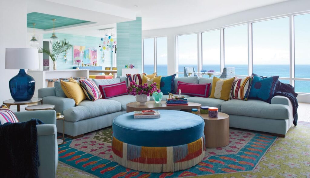
There seems to have been a no-neutrals rule at Renée Gaddis’ most recent project—at least in spirit. The owners of a waterside condominium on Naples’ Gulf Shore Boulevard called on the designer to transform their new home into an inviting coastal retreat for them and their visiting children and grandchildren. Then they gave her what every designer dreams of: carte blanche freedom with color. Gaddis came through with a prismatic, happy space that brims with life.
From first glance, we can see your clients were game for colorful interiors. How did you feel about that?
These homeowners wanted to embrace color wholeheartedly, and I loved it. Working with clients who aren’t afraid of color gives us the opportunity to create something unexpected, highly personal, and completely their own.
What else did they want for the residence?
A home that felt joyful, personal, and effortless, and that embraced the beautiful Gulf views while providing a comfortable gathering place for their children and grandchildren, who visit them often. Function and ease were as important to them as design, so every space was considered with family in mind.
Did the condo require many architectural changes?
Some. Previously, the layout was closed-off with heavy Tuscan influences, so a number of walls came down to improve the flow between rooms and create a brighter, more contemporary, and open space.
What was the main inspiration for the design?
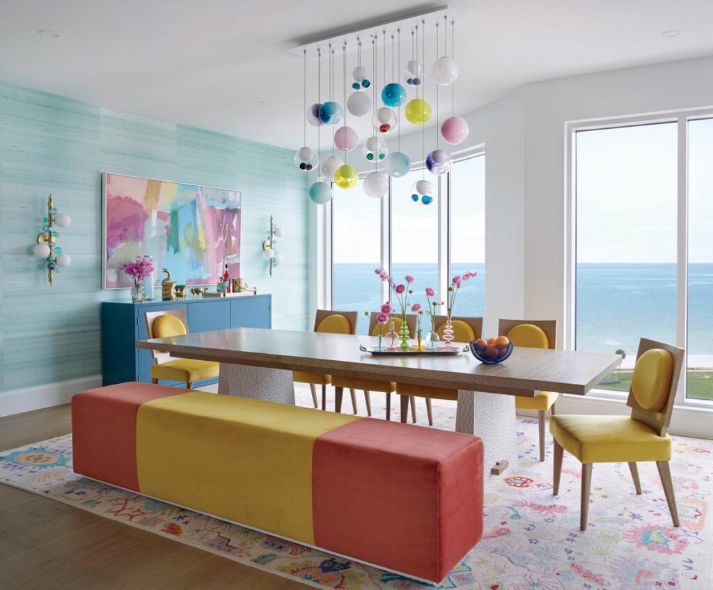
An incredible, colorful art collection that became the starting point for the home’s palette. We looked to that artwork to create a color story that feels vibrant yet cohesive.
Can you give us an example?
There’s a Venetian glass fish in the living room, easy to miss at first glance, and its vibrant colors influenced the hues we carried throughout the home and helped us create the collected feeling that defines the space.
Considering the home’s open layout, how did you keep the look cohesive with such a diverse palette?
The main living area establishes the overall color story, bringing the full palette together, while the individual spaces pull from and reinterpret those colors in their own way.
What was your approach to textures?
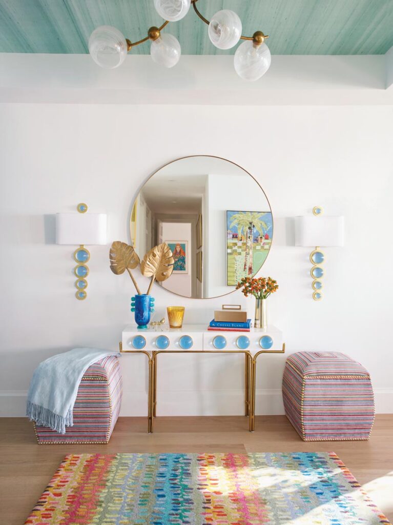
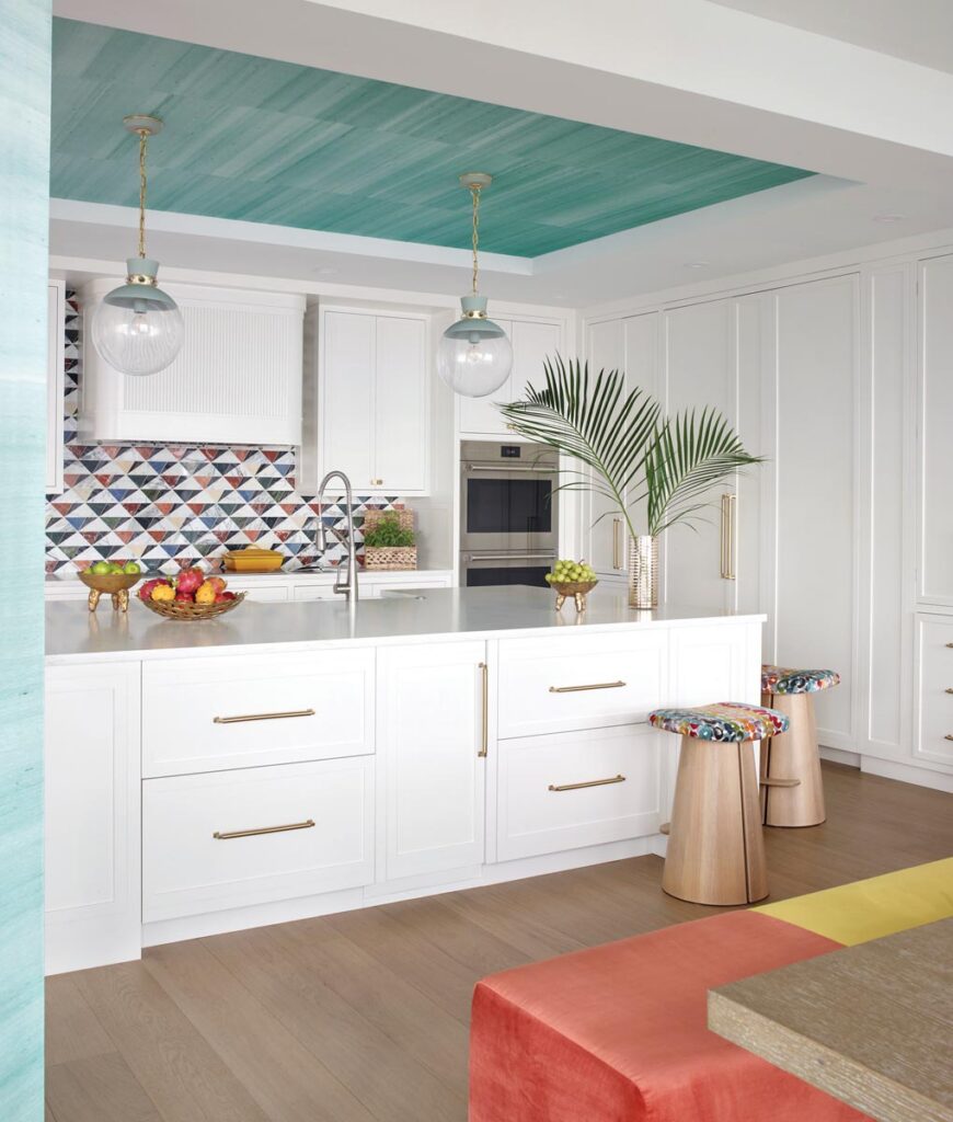
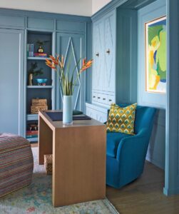
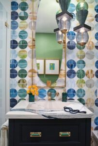
Every material was chosen to balance beauty with livability. We brought in detailed cabinetry, dimensional tile, and layers of texture throughout the home to add warmth and depth to an interior composed largely of hard surfaces. The goal was to make the space feel rich and inviting.
What about your flooring selections?
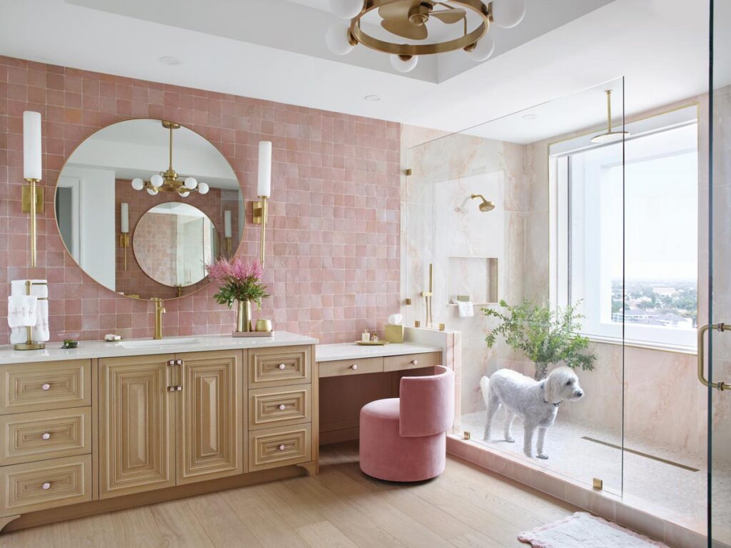
We chose a wide-plank European oak for the main living spaces to bring a softer, warmer element underfoot while also helping to absorb sound. In the bathrooms we used Zia tile with dimensional surfaces and varied textures to add depth and character.
What was your take on furniture?
We chose low-profile furnishings to preserve the water views as well as keep the overall aesthetic modern, relaxed, and livable. Because hosting their family is such an important part of the homeowners’ lifestyle, we paid close attention to scale and seating and incorporated everything from a generously sized bench at the dining table for the grandchildren to a dedicated mahjong table for the clients’ favorite pastime.
What was the most challenging part of this project?
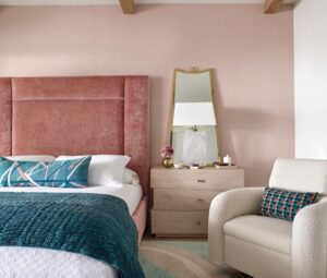
When you introduce this much color in a residence, the challenge is creating a space that still feels serene, warm, and like home. We achieved that by keeping some of the larger, foundational elements more subdued than usual.
How did the clients react to the finished space?
They were thrilled. It achieved exactly what they wanted: wow-factor and everyday functionality.
Story Credits:
Text by Florian Jouin
Residential Photography by Troy Campbell






Facebook Comments